The whole website design had to be based on the original identity, that was fashion oriented, eccentric and dynamic while at the same time simple and minimal in direction. This was achieved with the simplicity of layouts and colors as well as the right typography.
/ For Company: TPL IKE
Hermivo
Tags: Web Design, UI/UX Design, E-Commerce
Project Duration: 14 months
My Role: UI/UX Designer
The Product
Hermivo is a newly founded brand in the fashion industry. It is an internal project for the company I was working with, at the time. An e-commerce platform had to be developed and I got to design the whole web solution. The eshop offers a variety of well-known brands to its clients such as Guess, Salomon, Pepe Jeans, Superdry and more.
Get to Know the Product
Before starting this project many requirements were presented and everything was made clear after multiple internal meetings with the owner and the other parties involved (dev & marketing team). Agile was the methodology we implemented, so each newly discovered requirements would be added on the next sprint of the project journey.
Requirements
- Fashion Oriented
- Visually Aligned with Brand Identity
- E-commerce Functionality
- Clear Company Policies Incorporation
- Visible Customer Feedback
Design Specifications
- Bootstrap Based Framework
- 12 Columns / 4 Columns (Desktop / Mobile)
- Mega Menu
- Contained Website Design
- Live Search
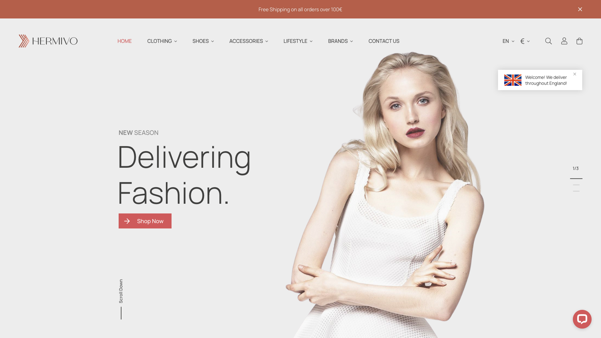
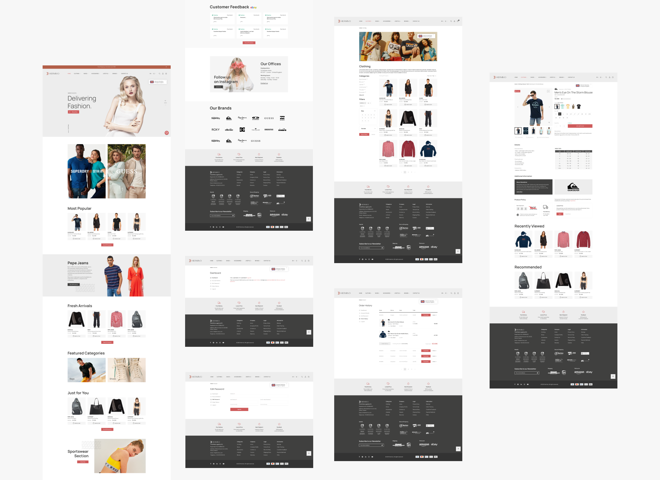
The Homepage
As a first place the user lands on, the homepage is crucial for the audience’s attention capture and conversion afterwards. A top clear banner was designed, that can be changed depending on the current season, featured brands sections, information architectures and selected products from the top to the best selling ones. All those sections were incorporated strategically on the homepage, aligned with a customer feedback section and a footer that contains company info, sitemap and everything the user has to know about the brand before making a purchase. We as a team, made clear that those info stay on each page of the website, so to implement those inside the footer was the best practice.
The Categories Page
The next step in the user’s buying journey, is the categories page. This is where they see all products mapped out. It was important to make clear to the user, that they can choose multiple filtering methods to clear out products they are not interested in and see the ones that are. With the right technologies implemented by the dev team after the design process of the website, filters like categories, color, size and gender were created.
The Product Page
Next is the products page. This is the part where the user gets to, when they are interested in a specific product. Here they can view more info about the product they like, see all available options like size / color and view product and company policies. It was important to have the buyer focused in the process so we implemented the add to cart button, to be viewed in each scroll of the user. That way they can get to buy the product at any time and point in the product page.
More Pages
Some more important pages are the contact page, in which the user learns about the available contact info of the company, the mega menu that hass all available categories and subcategories of products and of course the login / register page. We designed a login page that allows the user to have multiple ways of joining like the classic one or through Google / Facebook.
Types of Users
Type 1
The sport enthusiast. The guy that searches for the best sport gear, clothing and accessories on the market.
Type 2
The fashion seeker. The one who wants the most elegant and beautiful clothing from well-respected brands.
The Problems
Problem 1: Make the brand trustworthy to the client’s eyes.
Problem 2: Available buying and shipping options for everyone globally.
The Solutions
Solution 1: In each page of the eshop, there are visible company information and cleared out policies so the potential customer knows everything before their order. Also, in the homepage there is a dedicated customer feedback section that shows all the comments that the company has received during its lifespan, making the whole user-company bonding, stronger.
Solution 2: Having the proper implemented system, allowed us to recognise the visited user’s location and change the language and currency to the proper one. This allowed us to make a more friendly environment for the client that feels like ordering from a local shop of their choise. Finally, the proper functions were called during the checkout process, that only showed the available to the user’s location, shipping companies.
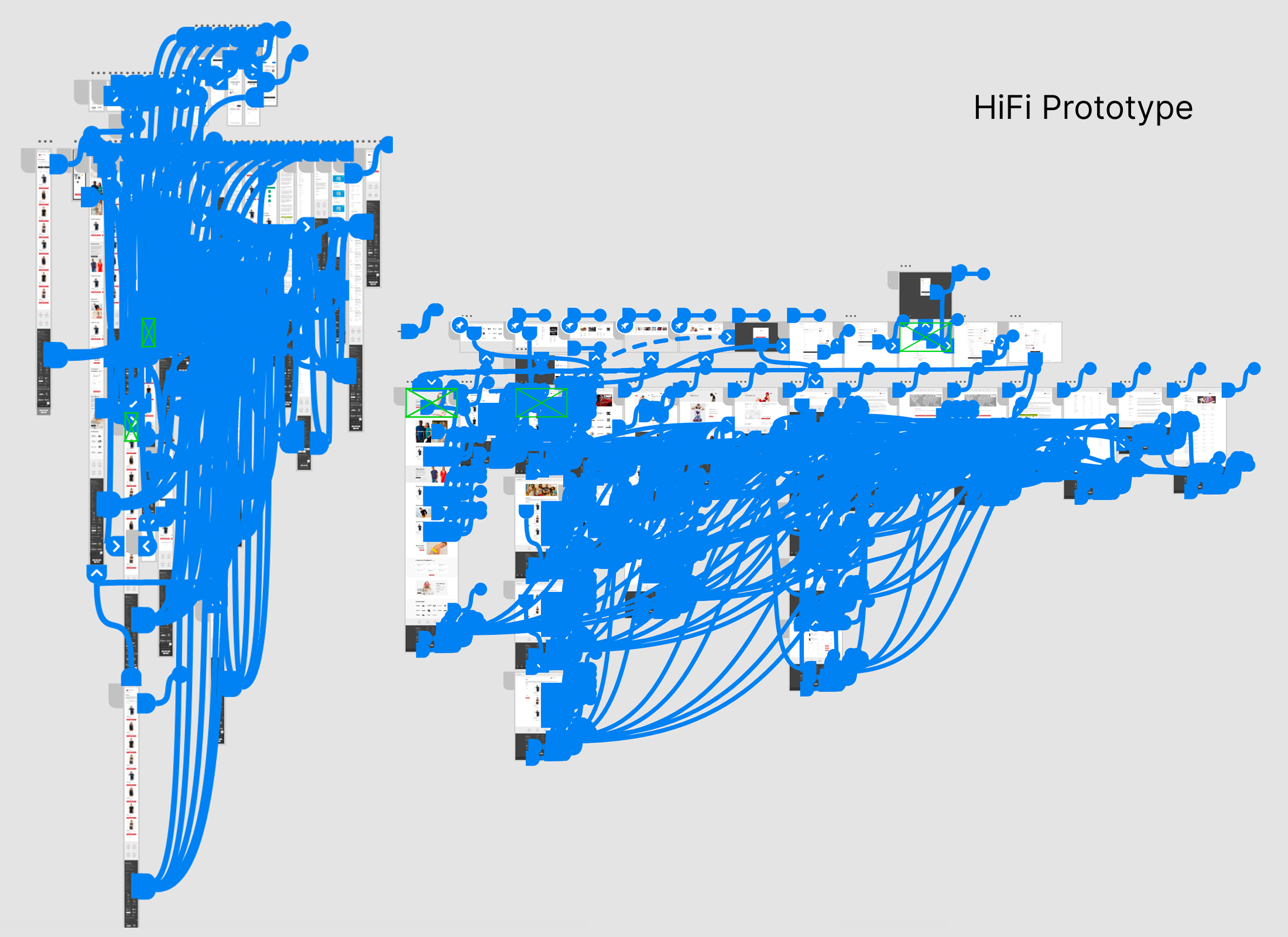
User Testing
After the development and launching of the website, we decided that the proper user testing tool should be used. One of those tools that made our life so much easier and simpler was HotJar.
We used HotJar to view page heatmaps and live customer walkthroughs. This allowed us to see any potential dead ends, problems in design or ways of making our product better in experience.